If you have a website but it doesn’t work well on small devices you may be thinking should you even bother updating the website? Times are about to change so here are 6 great reasons to have a mobile friendly website!
What exactly is a ‘responsive website’?
A responsive website is one that scales to the screen size of the device accessing your website. If you don’t know if your website is responsive or not you can use this free tool from Google to check.
So you can visualise what this means let’s look this image below which shows one that isn’t responsive and one that is…
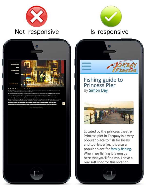
It’s clear in the example above that the non-responsive website on the left is unreadable without the user having to work at reading the site.
Now let me show you 6 great reasons why it is so important to get your website mobile ready…
#1 Your site is accessible to many more visitors
In the above example the non-responsive website forces the visitor to zoom, scroll and pinch to read the page. The responsive website on the other hand scales the text and layout based on the screen size of the visitor. By making the website readable across screen sizes the visitor doesn’t have to do a thing to view the content they want.
If you visit a website that is unreadable would you stay? If you’re honest you’d say no. Most people won’t bother having to work at accessing the content unless they really have to. If you don’t make the experience simple and easy for your visitor they have much less reason to stay.
#2 From May 2016 Google will rank mobile websites higher in searches
First let’s go back to May 2015 when Google announced some changes to the mobile search results. The first change was that mobile-friendly websites would have the words ‘mobile-friendly’ next to the listing to show that the site will work on mobile devices. Another change was that they were going to start gently trialling a change in the ranking systems to boost mobile-friendly websites in the search results.
From May 2016 Google WILL be boosting the rank of responsive websites. Google is going to start giving mobile friendly websites a higher ranking compared to those that are not. The only real exception to this are websites that have incredible authority on the subject of their content. If you think your non-responsive website is safe and is ranking well, think again! From May 2016 the results on mobile searches should be giving a much greater preference to mobile websites.
#3 Mobile Searches overtake desktop searches on Google
In May 2015 mobile searches on Google accounted for more than 50% of all searches for the first time. This percentage has climbed higher since then and it will only continue to climb.
#4 Google recommends responsive websites
It is pretty much unheard of for Google to endorse any particular technology (other than their own) but when it comes to responsive websites they have official endorsed it. Google doesn’t want to send their users to websites that are difficult to view. They want their users to easily access the websites they list.
If you rely on Google for your visitors then the time to ignore this is well and truly over. Google wants mobile friendly websites which means you should too.
#5 You only need one website to reach all devices
Web apps can be a way to get a website mobile friendly. The main problems with having two versions of the same thing are:
- Content updates to one will also have to be done to the other
- Fast-action updates like campaigns, special offers etc. have to also be repeated
- Needing to be aware of duplicate content unless it’s done correctly
- Any design updates have to be done twice
With a responsive website you only need the one website. Any time you change the content on the site it automatically scales. Once it is set-up you require much less time for updates so they are cheaper and much quicker to do.
#6 Chances are a number of your competitors are already ahead of you
This isn’t a gamble on cost vs reward, it’s a no-brainer. Google have made it very clear that they want more mobile-friendly results on mobile searches. Many of the big brands already have mobile friendly websites (or mobile friendly apps) and so do many smaller companies. Those websites that are ready for mobile visitors will now have a much greater chance of knocking YOU down the search results if you’re not.
So responsive is the only way to go?
Actually no. A responsive website is often a good option for small business with limited content and pages that aren’t filled with large files like high resolution images, scripts and other heavy items which slow down the loading time. If you have a lot of heavy content then it may be worth looking at a web app or phone app.
The user on a mobile will expect certain things in certain places. An example would be an easily accessible menu. It can sometimes be difficult to position the right things in the right places for a responsive website but it isn’t impossible. New websites built from the ground up have the easiest time because the code for the blocks can easily be positioned in the right places while the site is being built.
People did use to worry about having duplicate content because Google could penalise them for it. For mobile (m-dot sites) Google have said they have no issues.
Conclusion
It doesn’t really matter whether you go the responsive route or the web-app route. You just need to be aware that Google are really starting to push easily viewable websites so the time to ignore it is over.
Simon specialises in mobile-friendly, responsive design and he’d be more than happy to provide you with a consultation. Contact him on 07828 467 753 or fill out this contact form for more details.