If you have a website but it doesn’t work well on small devices you may be thinking should you even bother updating the website? Times are about to change so here are 6 great reasons to have a mobile friendly website! Continue reading

If you have a website but it doesn’t work well on small devices you may be thinking should you even bother updating the website? Times are about to change so here are 6 great reasons to have a mobile friendly website! Continue reading

Is your website mobile friendly? Have you taken the free mobile-friendly test yet? There is a big rolling-out of changes happening with the mobile search results on Google in 3 weeks time. Read what you need to know and how to check… Continue reading

As the years roll past I have redesigned many websites, both those I’ve created and those created by others. There are some really important steps to take before, during and after a website redesign. Continue reading
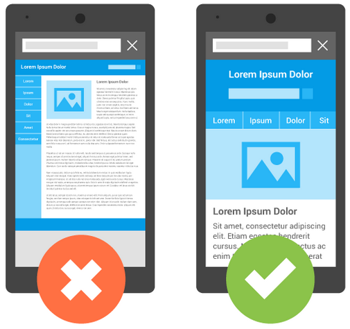
A responsive web design is a technique where your website will look just as good on a mobile as it does on a desktop. But why do you need to? Let’s take a look… Continue reading
I’ve finally had the chance to revisit my own website and update it.
I’ve used some very subtle CSS3 animations on the icons and buttons to highlight the calls-to-action in a way that it is obvious it will do something without it being too ‘in your face’.
I do like whitespace on websites so I’ve further improved each section of a page so the user flow is more seamless. The site is just as mobile responsive as it was before but the white space now makes it clearer and easier to view.
The top menu remains on the page as you navigate through the pages. It takes up little space and it again is just a simple thing that makes using the website that little bit easier.
Each page should be easier on the eye and easier to navigate. I’ve tried to keep my main calls-to-action in the same place on each page so again, each page should be familiar as you go from page to page.
Visit: SimonDay.Com

During the week this week I updated TorbayFishing.Com to be more responsive. The pages already scaled for mobiles and tablets but I wanted the whole page to scale seamlessly for desktop browsers, no matter the screen-size.
I switched the CSS rules for the structure to percentages, tested it across all browsers and uploaded it once I was happy it was working across the board.
Google analytics shows the hits are the same but the revenue from Adsense dropped by a whopping 82%. The ads are responsive so that wasn’t the issue. More people could see all the content and yet the revenue plummeted. I’ve had to switch back to the old version today and I’ll be setting up a A/B test on webmaster tools next week to see if I can track down the issue.
Sometimes doing the right thing can have huge consequences.
I’ve been working several websites over the last few weeks to bring them inline with Google’s mobile changes which came into force on the 21st April. From that date Google will start giving preference to mobile-friendly websites on all mobile searches.

Results now show ‘mobile friendly’
Although some of the websites I have created look fairly complex they all have simplistic structures which enables them to be easily updated, or in this case, have a responsive design with little extra work.
Google do have a mobile test tool so you can check to see if your website already passes. If you have a website and you need help or advice then please contact me.
I have been busy adding responsive styling to a number of existing clients which include: Continue reading