Google’s old page insight tool was pretty basic and not that friendly to use. Towards the end of last year Google completely revamped it and the results are lovely! Let’s take a look…

Let’s start off by saying Google is getting serious about mobile friendly websites. When they announced the default search results were going to be the mobile search results you know they means business!
Welcome to Google’s new mobile-friendly site checker. This has made the answer of knowing how your website ranks for mobile friendliness simple and it is super easy to use.
As the image above shows when you first land on the page all needs to know is the URL for your website and that is EVERYTHING you need to do to find your answers. How simple is that!
Once you click on the ‘test now’ button you’ll see a page looking something like this:
Google has broken the results into three sections: ‘Mobile Friendliness’, ‘Mobile Speed’ and ‘Desktop Speed’.
If you scroll down the page it will show you a page for each result and what you should do to improve it. It looks like this:

This is where it now gets a little foggy and there isn’t an easy solution.
Sometimes the recommendations say you need to fix something that;
- Can’t be done
- Has already been ‘mostly’ done
- Has already been completely done
Optimising the images is a good example of where it gets foggy. My homepage main image was initially 1,600kb which I got down to 150kb before going live. I then spent time pushing and pushing that as low as I dared before the quality loss was too much. I currently have it down to 77kb. That’s a HUGE drop from the initial 1,600kb but according to google it isn’t optimised and it should be. It’s the same for all the images on the page. I don’t want to push it any further because the quality hit is too great.
In the old insight tool it did the optimising for you and gave you a file with all the images and scripts done for you. Yet even after uploading Google’s own optimised images and minified scripts, the results still said they need optimising.
Don’t treat the recommendations as gospel and be aware that the problems it says are there may not actually exist.
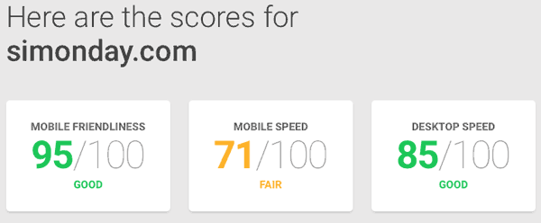
As you can see from my results above, I’m not 100% across the board and this is where you need to pay attention to what you really have to have on a page and what could be dropped if possible.
As a designer I have to push the boat on my own site and initially the page was really fancy with lots of cool stuff going on. It had lots of animations, image sliders, fancy gallery and so on. It looks great but it had a score of 95 / 35 / 50
I knew when I was building it I had to drop some of the fancy bits and try to reach a result I was comfortable with. I removed the showcase gallery, the top slider, some of the scripts they used and I then optmised the images and much as I dared. Even after all of that I still have a mobile speed result of 71. Most of my new clients came to me because of the way it looks now. I really don’t think I want to try to push it any further because all I can do now is drop the animations etc which I really don’t want to do.
The point is you don’t need it 100% all the way across and if you want anything fancy on a page the results will take a hit. You have to compromise what you want, what you would like and what you would sacrifice if you have to. I’m going to try and improve it a little more when I have the time but right now, I’m okay with the results.
Videos and images are the biggest impact factor on the results.
Every image you have a page will eat into that result quicker than you realise. An embedded video can plummet your score straight into single digits. The current trend is full width images so those images need to be big in width. Trying to keep those file sizes down, while not reducing the quality, can really test your skills.
I recently worked on a project for someone and I had it green across the board. Then two other people took over and this is the current live score:
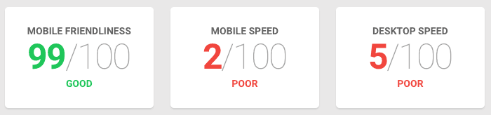
It is very easy to take a great score and destroy it within minutes. When the results are now SO important you have got to be careful and test the site all the way through development.
I recently wrote a post about how to optimise your images and how to speed up your website if you’re struggling to know what to do if your results are low.
The new tool is great to see at a glance how you’re doing in Google’s eyes. The fixes still remain a grey area, even with the new tool.