A/B testing is something I have used numerous times over the years but few realise the sheer power it contains. Let’s take a look at why and how… Continue reading
A/B testing is something I have used numerous times over the years but few realise the sheer power it contains. Let’s take a look at why and how… Continue reading
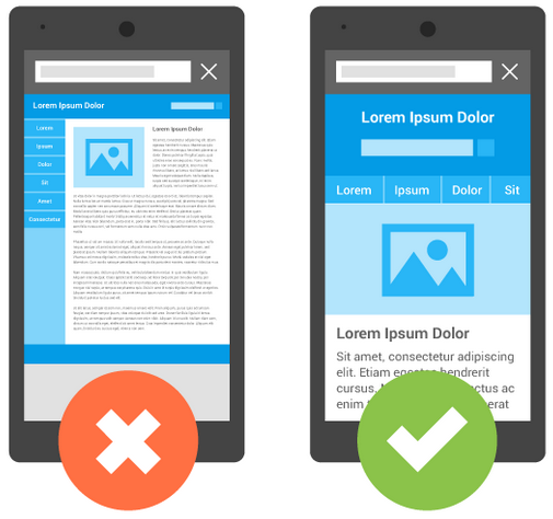
A responsive web design is a technique where your website will look just as good on a mobile as it does on a desktop. But why do you need to? Let’s take a look… Continue reading
This infographic from Apprenticeship Connect has compiled a great list of tips and tricks to land your dream apprenticeship! The infographic covers ways to find an apprenticeship, and then how to best present yourself. Continue reading
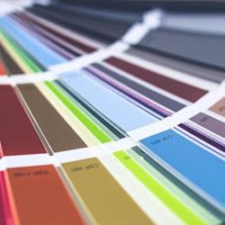
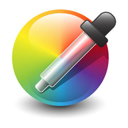
Colour plays a vital part in web design. Even the colours of a simple call to action button must be chosen carefully. Psychologists have suggested that colour impression can account for 60% of the acceptance or rejection of your product, service or web site. Continue reading
There has always been a multitude of formats you can use for your images but which format is right for which task can be a little daunting if you’re new to this. Continue reading
Branding is an incredibly important part of your business. It isn’t just the logo you need to plan for carefully but the colour, typography and how visually appealing it is. Continue reading

This handy little infographic gives you 12 tips to stockpile ideas and boost your productivity on Facebook. Continue reading

Twitter have compiled some new research from it’s own internal data, plus others like Nielsen, regarding the use of Twitter and tweets relating to TV.
Continue reading

When I first connected online in 1996 it was with a 2,500 baud modem, dialling into a bulletin board in London. My phone bills were astronomical 🙂
So much has changed in the last 15 years. It is hard to believe that, for example, Google Street view didn’t come along until 2007. Continue reading

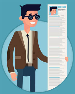
The tech World has been renowned for the job perks that come with it. Even back in the late 1990’s I remember seeing tech jobs with some amazing perks. So in 2015 what jobs come with really cool, or interesting perks? Continue reading