The way we design websites has changed so much over the years but one thing is certain, knowledge has shaped and refined many aspects of the layout.
There was a time when 90%+ of the visitors used one browser and one resolution. Back then 10px or 12px font size with an auto line-height were the norm. The page fold was simple to determine so you’d try to cram what you could into it.
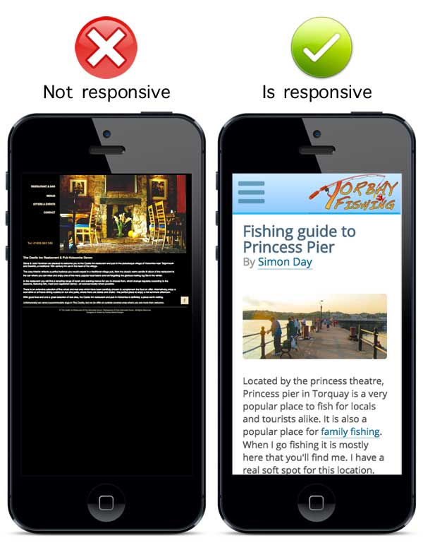
Now a successful website has to function from a mobile screen size up to huge iMacs and bigger.
# Fonts
Around 4 Billion people in the World wear some type of visual aid (glasses, contact lenses and so on). It is so easy to forget that for a lot of people, reading computer screens isn’t easy when fonts are too small. Many websites now use 14px to 16px (or the percentage, pt or em equivalent) as the default size. An ever-increasing pattern is also increasing the line-height gap between each line of text. This offers an easier readability than we once had.
Some designers used to rely on the browser ‘zoom’ capability to make text readable but I remember the frustrations my Dad used to have trying to navigate a website when the zoom broke the layout (back then the zoom only enlarged the text, not the whole page). We still have a similar issue now. Non-responsive websites will often display fonts so tiny in size that the visitor is forced to zoom the whole page to read it… but they also then have to keep scrolling left and right to read each line of text (just like in the image above).
It is important to test how responsive the design is for mobiles and to make sure the font size and its line height is still readable. Chromes Device mode can give you close approximation to how it will look.
Getting your own unique fonts were difficult and cumbersome back in the day. Google fonts has made the process much simpler and because of caching, more faster loading than ever before.
# Colour
You you remember the times you used to visit a website and see this…

OUCH! My eyes already hurt!
For many people picking the right colour schemes was not something that they could confidently do. There were few tools out there to help so it came down to design knowledge to make sure you didn’t make the website impossible to read. A jet black background with red text was also popular back then… and we cannot forget the patterned backgrounds which made it all but impossible to read anything!
There are plenty free colour wheels now to help you find the find colours to create a seamless design. Websites like http://paletton.com and https://color.adobe.com/create/color-wheel/ make the job of finding the right colour schemes even easier.
Sometimes it is useful to break the colour scheme to draw the eyes to something important. Having a page full of pastel colours with bright block can really draw your eyes to it. You must be careful but when it works it can work really well.
# White Space
A lot of people say that Apple was one of the first to embrace whitespace but I would say Google was the real trend-setter, long before it became a trend.
Google’s success was mainly down to the minamilist concept and embracing a LOT of whitespace to focus the visitors exactly where they wanted to be. When Google launched, the other search engines of the time (like Yahoo) filled their homepage with a lot of content. On dial-up modems they were all a pain and really slow. Google made searching fast and it was no surprise they overtook all competitors at the rate they did.
Never ever think of whitespace as wasted space. It works really well in drawing your eyes to where you want them to focus. It doesn’t even have to be white.
When you try to cram too much in the page fold area you can make it really difficult to find what you need. Whitespace is a trend I like and embrace on many of my projects.
Want to know more?
http://firstsiteguide.com came out with a really nice infographic to highlight other important areas…
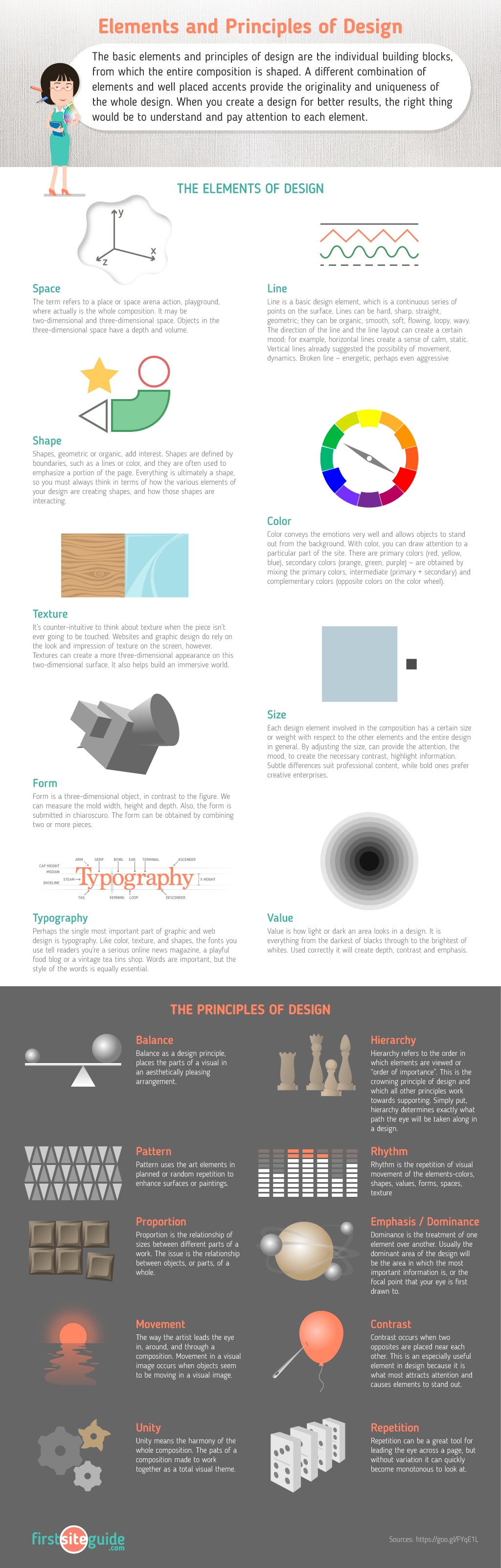
Elements and Principles of Design – Cheat Sheet was created by Firstsiteguide.com Team.